As the year comes to a close, arts marketers are feeling pressure to drive patron engagement through the holidays, and fast-approaching winter programming and exhibitions. That’s why it’s critical to continue delivering appealing and impactful ad messaging, and to stay top of mind.
One pretty great way to make sure your ads are in prime shape to perform at their best is to make sure your ad creative is awesome. Here are four tips for how to make that happen:
1. Don’t Forget Your Brand
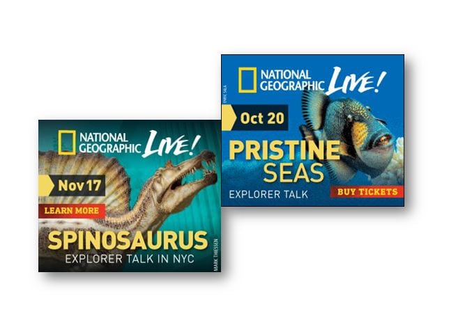
Whatever you do, don’t forget to let your patrons know that it’s you who is offering what you are offering. Branding encompasses more than just your logo, it’s about your presence and your story. See how The National Geographic Society incorporates their look and feel into all their social profiles, and keeps the theme consistent between their ad creative:
 2. Less is More
According to Hubspot, the attention span of a typical media consumer (your patrons) has shrunk to an astoundingly low 8.25 seconds. There’s a lot going on in the digital environment, and the average user is on their phone for a total of 3.15 hours a day! It’s critical that your creative is capturing your patron’s attention long enough for them to notice you and understand what it is you’re offering.
Most of the time with ad creative, less is more. If your creative is too busy, your CTA definitely won’t be seen and your patrons won’t know what to do. Make sure your creative design is clear. It doesn’t have to be mid-century minimalistic, but keep it uncluttered to ensure your messaging comes through. Remember, you only have a few seconds to hold your patrons’ attention! “Use strong, impactful imagery, and bright or contrasting color schemes.” Check out these great examples of crisp, clean, attention-getting creative from Steppenwolf Theatre’s production of East of Eden.

3.Use a Strong Call- to-Action
This tip applies not just to your ad copy, but to your creative design as well. First, make sure your ad has a call to action letting your patrons know what to do. No matter how beautiful your ad creative is, it will never perform well without call-to-action language, like “buy tickets,” “learn more,” “sign up,” or something else that conveys a sense of urgency. Don’t assume your patrons and potential patrons know what you want them to do.
For your creative design, make sure your call-to-action (CTA) button or link is clearly visible and easy to read. What good is strong ad copy if it’s hidden in a poor design? Catch your patrons’ eyes, and keep their attention.
Here are some of our partners’ examples of effective calls-to-action:
- Learn More
- Buy Tickets
- Buy Now
- Book Today
- Join Us
- Buy Now for Best Seats
In both examples from Steppenwolf and The National Geographic Society above, notice how the call-to-action button is red (attention-grabbing), and easy to read (“buy tickets”, “learn more”).
4. Get Your Ads Moving
Instead of always using static banner ads or Facebook ads, why not try some motion? Animated ads will make you stand out and as long as they aren’t overwhelming, will likely garner higher engagement than a static banner ad. Experiment with animated GIFs (technically “static” files, but they look like they are moving) and especially rich media like video (pre-roll and in-stream). Leverage these motion-based ads in the social environment and add some excitement to your patrons’ News Feed. The best part about video and motion is that it’s more engaging than banners. According to a 2012 study published by IAB, users who view rich media (video) are three times more likely to click through to a website than if they viewed a static banner.
